javascript ) highcharts.js로 도넛 그래프 그리기
javascript ) 차트 라이브러리 추천 예전에나 지금이나 차트를 표시해줘야 할 때는 c3.js를 잘 이용하고 있다. 근데 사용하다보니 디자인이 좀 질려서.. 직접 커스텀 하기는 또 귀찮고 다른 차트 라이
vivacolor96.tistory.com
앞전에 하이차트 라이브러리를 사용해서 도넛 차트를 만들었다.
기본 스타일이 마음에 들지 않아서 하이차트 자체에서 지원하는 옵션으로 차트 섹션 간 공백, border-radius, 데이터라벨 위치 등 스타일의 수정에 공을 들였지만 여전히 마음에 차지 않는다.
가장 마음에 안 드는건 차트 섹션 마우스 오버 효과와 데이터라벨의 흰색 텍스트 스트로크.
그 외에도 차트의 섹션을 클릭했을 때 나오는 효과도 마음에 안 든다.
자바스크립트와 CSS로 하이차트의 차트 스타일을 수정해보기로 한다.
당연히 CSS 수정은 CDN불러온 곳 밑에 작업해야한다.
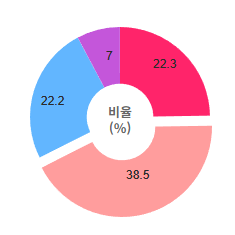
데이터라벨의 stroke 수정
저 흰색 스트로크는 차트 섹션 색상에 구애되지 않고 가시성을 확보하기 위해 넣어놓은것 같지만, 내 차트에는 필요가 없는 상황.
CSS로 수정이 가능하다.
CSS
|
1
2
3
4
5
6
7
8
9
10
11
12
13
|
.highcharts-data-label text{
font-size:12px !important;
font-weight:400 !important;
color:rgb(43,43,43) !important;
fill:rgb(43,43,43) !important;
}
.highcharts-data-label text .highcharts-text-outline{
font-size:12px !important;
font-weight:400 !important;
color:rgb(43,43,43) !important;
fill:rgb(43,43,43) !important;
stroke:none ;
}
|
cs |
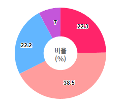
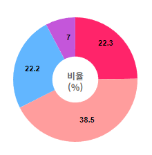
결과물
fill과 stroke를 css로 지워서 수정했다.
깔끔하게 잘 나온다.
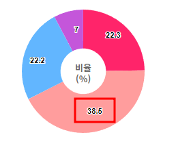
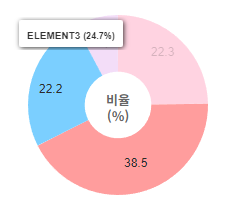
DataLabel 텍스트 잘리는 문제 수정
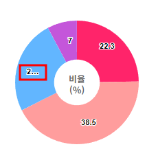
차트 영역의 가로 길이를 조금 줄였더니 데이터라벨 데이터가 잘려 나오는 곳이 있었다.
css로 저렇게 나오는 것도 아니고 아예 소스에서부터 줄임 표시되어 노출되고 있다.
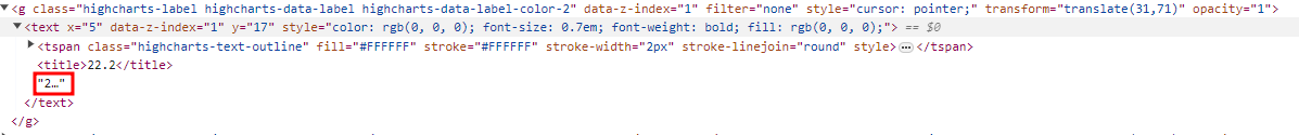
다행히 그 위에 <title> 태그에 원래 데이터가 있었다.
하이차트가 로딩된 후 실행하는 함수인 load함수를 이용해서 해당 내용을 수정했다.
javascript
|
1
2
3
4
5
6
7
8
9
10
11
12
13
14
15
16
17
18
|
Highcharts.chart('GraphSection', {
...
events: {
load: function() { // 차트 로딩 완료 후 아래 내용 실행
...
$(".highcharts-label.highcharts-data-label text tspan").remove(); // 줄임표 표기되는 tspan 태그 모두 지워줌
$(".highcharts-label.highcharts-data-label").each(function(){
var title = $(this).children("text").children("title").text(); // highcharts-data-label 클래스 > text 밑에 title태그가 존재 할 때 (줄임말 표시 여부 체크)
if(title){
$(this).children("text").html(title); // highcharts-data-label 클래스 > text의 html을 title 값으로 바꿔줌. (원래 데이터로 대체)
}
});
...
}
}
},
...
});
|
cs |
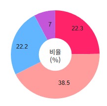
highcharts-data-label 클래스 > text 밑에 tspan을 삭제해주고, 줄임말 표기가 될 때를 구분해서 원래 데이터로 노출되는 값을 바꿔줬다.
차트가 로딩되고 나서 실행된다.
결과물
원하는데로 잘림 없이 잘 노출된다.
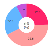
도넛 차트 마우스 오버 효과 수정
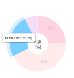
도넛 차트의 각 섹션에 마우스 오버 했을 때, 테두리 효과가 거슬린다.
CSS로 수정해준다.
CSS
|
1
2
3
|
.highcharts-halo{
fill-opacity:0 !important;
}
|
cs |
결과물
CSS로 간단하게 수정이 되었다.
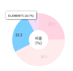
마우스 클릭 스타일 수정
클릭하면 저렇게 떨어져나가는게 기본 효과다.
클릭 이벤트는 옵션으로 끄는게 가능한데, 나는 클릭은 되지만 떨어져나가는 효과는 없애고 싶었다.
클릭이벤트이기에 javascript에서 수정한다.
차트 로딩이 완료 된 후 실행되는 load 함수 안에 javascript 소스를 추가했다.
javascript
|
1
2
3
4
5
6
7
8
9
10
11
12
13
14
15
|
Highcharts.chart('GraphSection', {
...
events: {
load: function() { // 차트 로딩 완료 후 아래 내용 실행
...
$(".highcharts-series-group .highcharts-series path.highcharts-point").click(function(){
$(this).css("transform", "translate(0,0)"); // 클릭했을 때 transform:translate 변경
});
...
}
}
},
...
});
|
cs |
결과물
분홍색 영역을 클릭하고, 파란색 영역에 마우스 오버를 한 상태다.
클릭해도 튀어나가지 않는다.
마음에 든다.
하이차트 커스텀 소스 & 결과물
HTML
|
1
|
<div id="GraphSection"></div>
|
cs |
CSS
|
1
2
3
4
5
6
7
8
9
10
11
12
13
14
15
16
17
18
19
|
#GraphSection{
overflow: hidden;
}
.highcharts-data-label text{
font-size:12px !important;
font-weight:400 !important;
color:rgb(43,43,43) !important;
fill:rgb(43,43,43) !important;
}
.highcharts-data-label text .highcharts-text-outline{
font-size:12px !important;
font-weight:400 !important;
color:rgb(43,43,43) !important;
fill:rgb(43,43,43) !important;
stroke:none ;
}
.highcharts-halo{
fill-opacity:0 !important;
}
|
cs |
javascript
|
1
2
3
4
5
6
7
8
9
10
11
12
13
14
15
16
17
18
19
20
21
22
23
24
25
26
27
28
29
30
31
32
33
34
35
36
37
38
39
40
41
42
43
44
45
46
47
48
49
50
51
52
53
54
55
56
57
58
59
60
61
62
63
64
65
66
67
68
69
70
71
72
73
74
75
76
77
78
79
80
81
82
83
84
85
86
87
88
89
90
91
92
93
94
95
96
97
98
99
100
101
102
103
104
105
106
107
108
109
110
111
112
113
114
115
116
117
|
// 차트 기입 DATA
var chartData = [
{
name:'ELEMENT1', // 데이터 이름
y:22.3, // 데이터 수치
dataLabels: { // 데이터라벨 위치
y:10,
x: -40,
}
},
{
name:'ELEMENT2',
y:38.5,
dataLabels: {
y:-30,
x: -25,
}
},
{
name:'ELEMENT3',
y:22.2,
dataLabels: {
y:10,
x: 40,
}
},
{
name:'ELEMENT4',
y:7.0,
dataLabels: {
y:25,
x: 25,
}
}
];
// chart 로딩
Highcharts.chart('GraphSection', {
chart: {
height: 200, // 영역 가로길이
width: 250, // 영역 세로길이
margin: [0, 0, 0, 0], // margin
animation: true, // 마우스 오버, 클릭 애니메이션 사용
animation: {
duration: 100 // 마우스 오버, 클릭 애니메이션 속도
},
events: {
load: function() { // 그래프 로드했을 때 아래 내용 실행
$(".highcharts-series-group .highcharts-series path.highcharts-point").click(function(){
$(this).css("transform", "translate(0,0)")
});
$(".highcharts-label.highcharts-data-label text tspan").remove(); // 줄임표 표기되는 tspan 태그 모두 지워줌
$(".highcharts-label.highcharts-data-label").each(function(){
var title = $(this).children("text").children("title").text(); // highcharts-data-label 클래스 > text 밑에 title태그가 존재 할 때 (줄임말 표시 여부 체크)
if(title){
$(this).children("text").html(title); // highcharts-data-label 클래스 > text의 html을 title 값으로 바꿔줌. (원래 데이터로 대체)
}
});
// 도넛 그래프 가운데 텍스트
var value = "비율<br>(%)";
var chart = this;
chart.renderer.text(value, null, null, chart.resetZoom, {
}).attr({
align: 'center',
verticalAlign: 'middle'
}).add().css({fontSize: '13px', fontColor:'rgb(102, 102, 102,)', fontWeight:'bold', fontFamily:'Noto Sans KR', fill:'rgb(102, 102, 102)'}).align({
align: 'center',
verticalAlign: 'middle',
x: 0,
y: 0
}, false, null);
}
}
},
credits: {
enabled: false // highcharts 우측 하단 Highcharts.com 텍스트 표기
},
title: {
enabled: false, // 차트 타이틀 사용 안함
text: null, // 차트 타이틀 텍스트 비움
},
plotOptions: {
pie: { // 파이 그래프 사용
dataLabels: {
enabled: true, // 그래프 영역 안에 수치 표기
},
animation: true,
},
series: {
borderWidth:0, // 그래프 섹션 사이 간격
borderRadius:0, // 그래프 섹션 별 border-radius
}
},
legend: {
enabled: false // 차트 영역 별 설명 기능 사용 안 함
},
tooltip: {
valueSuffix: '%', // 툴팁 수치 단위
format: '<div style="white-space:nowrap;width:150px;font-size:10px;font-weight:bold;">{key} <span style="font-size:9px;">({point.percentage:.1f}%)</span></div>' // 섹션별 툴팁 표기 내용 {point.percentage:.1f}가 수치
},
series: [{
type: 'pie', // 그래프 타입 : 파이
allowPointSelect: true, // 차트 섹션 선택 가능
cursor: 'pointer', // 차트에 마우스 오버했을때 포인터 표시
size:'100%', // 도넛 차트 크기
innerSize: '37%', // 도넛 차트 가운데 구멍 크기
colors: ['#ff246a', '#ff9d9d', '#62b6ff', '#c456da'], // 각 섹션별 색상
data: chartData, // 차트 데이터
dataLabels: { // 차트 섹션 별 내용
inside:true,
format:'{y}',
align:'center',
distance: '0',
}
}, ],
});
|
cs |
결과물
별거 아닌데 오래걸렸다.
검색해도 잘 안나오고..
다음에 작업할 땐 좀 더 빠르게 작업할 수 있었으면 좋겠다.
'개발 > Javascript' 카테고리의 다른 글
| javascript ) highcharts.js로 도넛 그래프 그리기 (1) | 2024.02.12 |
|---|---|
| javascript ) 차트 라이브러리 추천 (0) | 2023.12.12 |
| javascript ) c3.js 차트에 데이터 연동하기 (ajax + php + mysql) (0) | 2023.12.11 |